Jacob Stephens
Prof. Karl Crisman: Survey of Calculus
18 November 2013
Final Draft Functions Essay
Waiting for change: Functions in the
biology of intestinal absorption and microbiota
How do things change? Differential calculus addresses this question when it involves numbers. If something is changing but its input and output cannot be described with numbers, it’s change cannot be studied with calculus. Functions describe the way an input value is manipulated to result in the output. These sorts of relationships pervade the natural world, one number in, something manipulates the number, and another comes out. The world of living organisms is rich with prime examples of this. I will observe what sort of numerical changes commonly happen within the biology of intestinal absorption and microbiota.
I will be looking at the change in abundance of microbes based on diet, as well as the change in intestinal absorption dependent on diet. Intestinal absorption of certain nutrients is the numerical output. The amount of that substance eaten will be the input. What causes the output, say 1g of iron excreted, to change for the same input, say 2g of iron ingested, will be diet for the examples I look at. The diet thus is not a number specifically involved in the input or output, but it is the factor which causes the input to be manipulated differently.
I will step through a number of examples and then make conclusions about trends in the functions concerning dietary affect on intestinal microbiota and absorption. For abundance of microbes, the input will be differing amounts of nutrients, which will result in differing outputs of the number of the individual being observed. For example, if a person’s diet begins 60g of protein, and their gut starts with 1000 Clostridium difficile (a pathenogenic gut bacteria), after a change in diet to 70g of protein, the abundance might increase to 5000 C. difficile. Here the factor which changes the way the input (grams of protein) affects output (number of C. difficile) could be a number of things, such as the way protein affects C. difficile. The way that protein affects C. difficile could have a number of different relationships. An increase in protein could linearly affect the C. difficile population, or exponentially decrease it. The way that this input affects the output is called the rate of change
The input can also be time for microbiota and absorption, in which case the input is how much time passes, and the output is whatever the researcher is measuring. If microbes, perhaps the abundance of individuals as it changes daily after a diet change. If absorption, perhaps whether the amount of a nutrient absorped changes from day to day or remains steady. I focus on functions that relate to dietary & weight input, and physiological outputs, like bacteria abundance or absorption rates. Nearly every scientific paper includes graphs. Biology often includes functions because they easily show the affect of something on another thing.The data observed in intestinal absorption is commonly a substance injected into a body, and then their concentration is tracked over a period of time. These functions commonly have time and amount of the substance being identified. The different variables present are then graphed as separate lines. Researchers commonly present this information in graphs.
In microbiota functions often include non-time inputs. Researchers often use graphs for functions normally. The types of behavior modeled are location of microbiota, as well as weight. The functions are exponential, with a concave down usually. Biological functions commonly have a certain group of traits. Researchers commonly present functions with graphs and tables. The many variables present in biology make creating formulas difficult to accurately predict behavior.
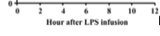
The next section will involve me going through a variety of absorption related functions. Waggoner (2009) performed an experiment in which a lipopolysaccharide solution was injected into a cow, and then the cortisol concentration in the cow was measured over the next 12 hours (Graph 1). Here the input is time in hours, and the output is cortisol in mg/mL. This function is not linear, because the points do not form a straight line. The function increases initially, then decreases. It is concave down for nearly the entire function, until the last bit where it changes to concave up. It is graphical because the concentration of something in a body is easy to correlate with a curve. The graph shoots up initially and then calms down after 6 hours. This shows visually the levels of a substance in a cow over time. The thing that manipulated the input number into an output was the cow.
Lemmens (2011) performed an experiment in which different runners were fed different diets at different times (Graph 2). For example, some were fed carbohydrates while stressed, others a protein focused meal while resting, etc. This graph is very similar to the previous one. The input is time, the output is salivary cortisol in mmol/L. With a graphical format, it is easy to see which diets made runners produce the most cortisol, and at what times that happened.
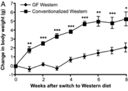
Part of an experiment Backhead performed in 2007 resulted in functions where the change in mouse body weight was a function of time (Graph 3). These he communicated graphically. The increase seems linear on this linearly scaled graph. Increments of 1g on the output axis, and intervals of 1 week on the input axis. Data on this graph has the units g/week. If average rate of the entire line is taken, the result would be called the average rate of change for that data. If the rate of change were taken for a single data point (which could be done using left/right hand estimation).
There are two other graphs associated with Graph 3. The bar graph is not a function because it does not have numerical inputs. The other graph is, again, with time as an input. This is a common input for absorption, likely because people who study this are interested in how the presence of a nutrient changes some quality of the body over time.
The next section of the paper will involve me walking through and observing different functions in microbiota and microbiology. In Methé (2012) I found a function graphed by researchers taking samples from certain body areas, and measuring the number of new genes discovered using 16S sequencing. This measures the amount of new species discovered per sample. The curve is concave down, and exponentially decreasing. The output is displayed on a log scale, this is probably because the results cannot be clearly displayed without it. The different body areas have different curves associated with them. The stool contained many more new species than the other sites, and thus was hit a higher peak. The anterior nares has a higher slope than the supragingival plaque, so the rate at which unique genes are being discovered per sample is greater for the anterior nares. This graph communicates that as the number of samples increase, the number of new genes discovered increases, and the rate at which new genes are discovered per sample decreases. That reasoning is an example of making a conclusion about the derivative, the change in the original functions rate. A statement about the rate at which the rate of change is changing would be second derivative conclusion.
In this same paper there is a graph which displays a ratio as the as a function of the number of individuals sampled. The output is unique genes discovered per operational taxonomic unit (OTU). Microbiologists use OTUs to distinguish species (Wooley et al. 2010) The input is the number of samples. At first this looks like a graph of a derivative, but upon closer inspection I realized that a graph of the derivative requires the input unit to be somewhere in the units for the output. This function is the combination of two functions, a function of genes/sample and OTUs/sample, to make a graph of genes:OTU/sample.
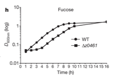
In Pachero et al. (2012) there is function depicting a growth curve for two types of bacteria with a fucose carbon source (Graph 4). The input is time in hours and the output is absorbance of light on a log scale. D stands for optical density, which is cell number per volume. This is measured using a spectrophotometer, the resulting number is a percentage called absorbance. Thus bacterial abundance can be measured according to how much light passes through a cell culture in a cuvette. Bacterial growth is plotted on a log scale because bacteria grow at an exponential rate. If something is increasing at an exponential rate it will run off of the graph fairly quickly, so if it is plotted on a log scale, the exponential change will become a straight line. From this I learn that counting the number of bacteria is typically done by measuring the percentage of a certain wavelength absorbed through a cuvette of cell culture. More important mathematically here is the use of a log scale for a graph.
There are a variety of ways I am finding functions in microbiota literature. I am finding functions easily by looking at the figures associated with scientific articles. These are usually free and along side of the abstract of a preview to an article. The text that explains the figures are usually enough to understand what is being plotted. To find tables I must go into the full text of the article. Formulas I have found none yet in scientific articles, but I have found a few outside of research articles in educational articles published by universities.
I found formulas for biological functions by looking in a different type of scientific article. In this article describing theory and method there are formulas. In the research articles of microbiology I have found no formulas. Widdel (2007) describes a process for calculating the number of cells after a certain period of time. The formula is cell number = f (time). Interpreted, this means that cell number is a function of time. Time is the input, or independent variable, and cell number is the output, or the dependent variable.
Later in the article Widdel (2007) discloses a more specific formula for cell growth:
N = N0 * et/t_d (1)
Here N equals the number of cells at a certain time, the output. t equals time since the beginning, this is the input. t_d is a constant that changes based on the bacterial species. It is the time it takes for cells to double. N0 is the number of cells present at the beginning of the test. e is the base of the exponent because that is the number which many natural functions have.
In Claesson (2012) I found a table in microbiotal literature (Graph 5), but this table shows correspondence, not a function. There are many tables like this in microbiotal literature. Here are two sets of data plotted, one on the vertical axis and one on the horizontal. Each axis measures the percentage of variance that a set of data has. The further out the axis the higher percentage of variance a data point has. This shows the correlation between two sets of data.
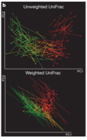
Graph 6 in the same paper describes the relationship between certain phylogenetic trees. The input again is not numerical, but the output here is displayed with a color key. I haven’t before thought to graph something using color to indicate numbers. This is done because the volume of data is so large that to put all of these points on a line graph would be nearly unintelligable. Also, because the range of output values is small, this can be done more easily. A computer allows there to be a range of colors for different values. This can be easily observed by a person and conclusions about patterns can be drawn. Sadly this is not a function. I wish I knew a way to give a number to the species represented here.
Qin (2009) presents two microbiota functions in graph 9. The input guages the P-value, which measures for outliers (P values… n.d.). It does this by measuring the average difference in size between certain results. So if one result is 5 units, and the rest average to 0.05, the p-value would be high for that 5. Here, the output is Density, and this is measure by which the p value must equate to. So here a rating is put in as the input, corresponding with that p value is a density value. These data pairs exist, and there may be a relationship with them. One could make a formula for this function with the average rate of change, that would be innacurate though, because this line changes exponentially, not linearly. It may even level off at the end.
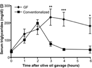
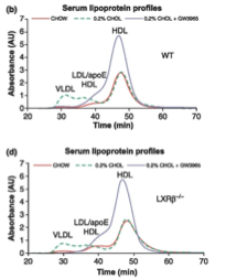
Hu et al. (2012) summed up his experiment with graphs of three functions he observed. These functions had time for input and absorbance of cholesterol for output. Each graph portrays three different functions. What makes these graphs different is the way that the numerical input is manipulated to provide the numerical output. Three different diets cause the absorption of cholesterol to be different for these animals. Each different graph has all three of these diets, but the difference between each graph is the type of mouse being tested with these different diets. These dietary and mouse strain factors are not numerical, but they cause the manipulation of the input to differ. Though it would seem like the input is diet, from a calculus perspective, here the input is time.
There is numerical difference between the different diets—the amount of cholesterol that was added to them, so if many tests were peformed with changes in the percentage of cholesterol added, a new function could be formed. Each experiment to find these numbers for one function would have to be the same conditions asides for the cholesterol change, or else the cholesterol change might not be the factor which is actually causing the change in cholesterol absorption.
Observing the curves of these graphs, there are from one to three local maximums for each, and zero to two local minimums. This is because the graph is measuring the change in absorption in a substance. At the beginning zero has been absorbed, so that is where all of the graphs start. The outputs must remain at zero. The maxima and minima can easily be observed on these graphs. If the line was much more jagged, and if it had smaller measurments between changes in slope it would be difficult to observe the maxima and minima verbally. That is where calculating them would become necessary. I haven’t yet found any functions which such intense up and down changes in slope that we would need to do this to determine local minima or maxima.
What trends are common in the functions present in intestinal absorption and microbiota? The functions of intestinal absorption require less technical knowledge to understand. The functions of microbiota often involve non-time inputs, and there are many graphs in microbiotal literature that look like functions, but are simply correlations. In intestinal absorption the output of functions commonly increase then decrease. Sometimes these fluctuations are linear and at other times they are exponential.
In microbiota there are functions that describe correlations, and functions which assess statistical accuracy of tests. Many functions are graphed with scatter plots and then connected with lines in a web-like fashion. Observing a simple formula in these results proves difficult, because the results seem to be more in clusters than in a line. Within microbiology, there are formulas that describe baterial growth, these can be useful when simple, but to be made more accurate they become complex. These formulas are not commonly used in the research of microbiota and intestinal absorption though. Results with negative outputs almost never surface. The way things change is commonly discussed numerically in biology though, most research articles have at least one function observed through a test conducted by the researchers. Many things in living organisms change and these rates of change can be measured numerically, creating many applications for calculus within biology.
Appendix:
Graph 1


Graph 2


Graph 3

Graph 4

Graph 5

Graph 6

Graph 7

Graph 8


Graph 9
Graph 10


References
Backhed F, Manchester JK, Semenkovich CF, & Gordon JI. 2007. Mechanisms underlying the resistance to diet-induced obesity in germ-free mice. Proc Natl Acad Sci USA. 104:979–984.
Claesson, M. J., Jeffery, I. B., Conde, S., Power, S. E., O’Connor, E. M., Cusack, S., … & O’Toole, P. W. (2012). Gut microbiota composition correlates with diet and health in the elderly. Nature, 488(7410), 178-184.
Hu, X. X., Steffensen, K. R., Jiang, Z. Y., Parini, P. P., Gustafsson, J. Å., Gåfvels, M. M., & Eggertsen, G. G. (2012). LXRβ activation increases intestinal cholesterol absorption, leading to an atherogenic lipoprotein profile. Journal Of Internal Medicine, 272(5), 452-464. doi:10.1111/j.1365-2796.2012.02529.x
Lemmens SG, Born JM, Martens EA, Martens MJ, Westerterp-Plantenga MS. 2011. Influence of consumption of a high-protein vs. high-carbohydrate meal on the physiological cortisol and psychological mood response in men and women. PLoS One Feb 3;6(2):e16826.
Methé, B. A., Nelson, K. E., Pop, M., Creasy, H. H., Giglio, M. G., Huttenhower, C., … & Buck, G. A. (2012). A framework for human microbiome research. Nature, 486: 215-221.
Pacheco,
A. R., Curtis, M. M., Ritchie, J. M., Munera, D., Waldor, M. K., Moreira, C.
G., & Sperandio, V. (2012). Fucose sensing regulates bacterial intestinal
colonization. Nature.
Qin, J., Li, Y., Cai, Z., Li, S., Zhu, J.,
Zhang, F., … & Yang, H. (2012). A metagenome-wide association study of
gut microbiota in type 2 diabetes. Nature, 490(7418), 55-60.
“P-values, False Discovery Rate (FDR) and q-values.” n.d. Available from: (http://www.totallab.com/products/samespots/support/faq/pq-values.aspx). Accessed 20 November 2013.
Waggoner J. W., C. A. Löest, J. L. Turner, C. P. Mathis, D. M. Hallford. (2009). Effects of dietary protein and bacterial lipopolysaccharide infusion on nitrogen metabolism and hormonal responses of growing beef steers. Journal of Animal Science 87.11:3656-3668.
Widdel, F. (2007). Theory and measurement of bacterial growth. Di dalam Grundpraktikum Mikrobiologie, 4.
Wooley, J.C., A. Godzik, I. Friedberg. 2010. A primer on metagenomics. PLOS Computational Biology. 10.1371/journal.pcbi.1000667
I wrote this paper for the Gordon College course, Survey of Calculus. Below is the syllabus.